Developing an effective infographic for policymakers – The winning submission from the OARSI/OAAA Infographic Competition – July 20, 2022
July 20, 2022
![]() Description: This pre-recorded presentation will outline how the presenters developed their winning infographic (see below-click to enlarge) aimed at policymakers and present some practical tips for the development of effective infographics to communicate your research.
Description: This pre-recorded presentation will outline how the presenters developed their winning infographic (see below-click to enlarge) aimed at policymakers and present some practical tips for the development of effective infographics to communicate your research.
Speakers: 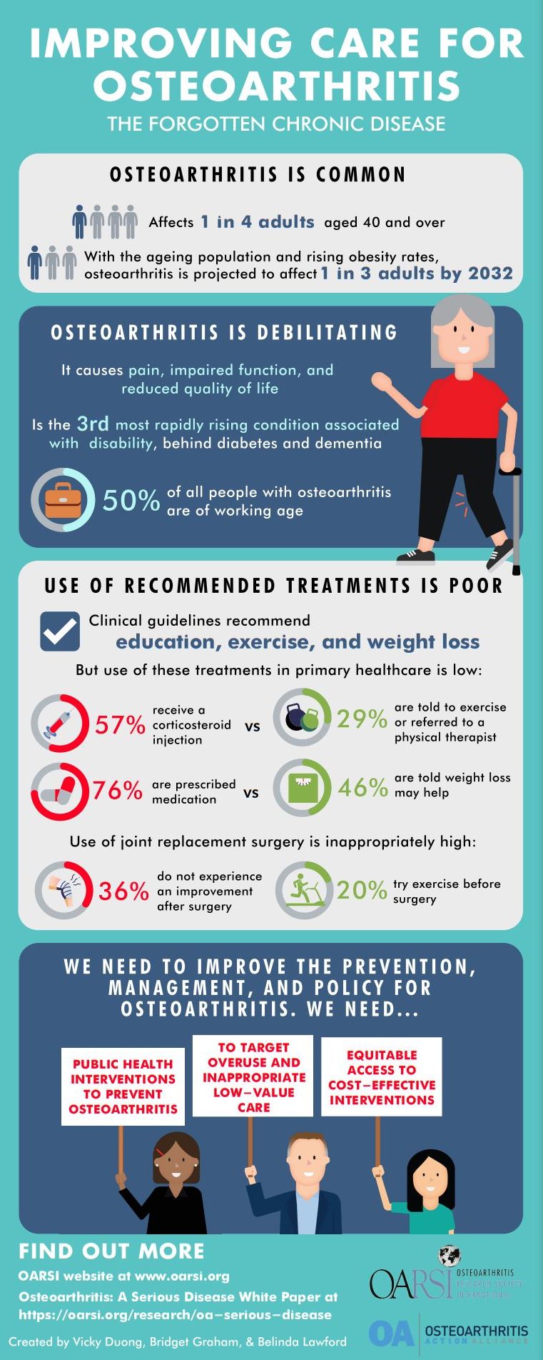 Bridget Graham is a physiotherapist and clinical trial coordinator, working at the Centre for Health, Exercise & Sports Medicine at the University of Melbourne. Her research interests include conservative treatment strategies for osteoarthritis and remotely delivered care models. She is keen to help people live better with osteoarthritis, inspired partly by her previous work as a physiotherapist in aged care. Vicky Duong is a Research Officer and final-year PhD student at the University of Sydney. She graduated from Macquarie University with a Doctor of Physiotherapy degree in 2015, prior to this she completed a Bachelor of Science (Honours Kinesiology) at the University of Waterloo (Canada) in 2011. Her research is focused on the adherence to core treatments in osteoarthritis. Vicky is passionate about bringing evidence-based knowledge to consumers and is the editor of the Joint Action Podcast (www.jointaction.info/podcast). Belinda Lawford is a post-doctoral musculoskeletal researcher at the Centre for Health, Exercise & Sports Medicine at the University of Melbourne. Her research focuses on clinical trials and qualitative studies of treatment strategies for people with osteoarthritis, in particular telehealth-delivered care, exercise, and weight loss. Her research aims to develop and evaluate strategies to improve the management of osteoarthritis in Australia and worldwide.
Lunch & Learn Recording & Transcript
Disclaimer:
The content displayed in this transcript is the intellectual property of Bridget Graham, Vicky Duong, and Belinda Lawford. You may not reuse, republish, or reprint such content without written consent. The contents are those of the author(s) and do not necessarily represent the official views of, nor an endorsement, by OA Action Alliance, CDC/HHS, or the U.S. Government. This transcript was automatically generated in Zoom, and edited for clarity, however, the OAAA cannot guarantee there are no mistakes or errors.
Date: July 20, 2022
Title: Developing an effective infographic for policymakers – The winning submission from the OARSI/OAAA Infographic Competition.
Presenters: Bridget Graham, Vicky Duong, and Belinda Lawford
INTRODUCTION:
(Katie Huffman): Hello and welcome to the Osteoarthritis Action Alliance Lunch and Learn webinar for July 20th, 2022. In the fall of 2021, OARSI (Osteoarthritis Research Society International) collaborated with the OA Action Alliance to sponsor an infographic for policymakers’ competition. Policy makers play a critical influential role in crafting and enacting rules, laws, and regulations, delivering guidance documents and directing public investment and research that positively affects the lives of people with OA. The competition challenged designers to come up with an infographic that would convince policymakers that investments in OA research improve quality of life and increase productivity. Today, we are pleased to share a prerecorded presentation from the winning team of the infographic contest: Bridget Graham, Vicky Duong, and Belinda Lawford.
Bridget Graham is a physiotherapist and clinical trial coordinator working at the Center for health exercise and sports medicine at the University of Melbourne. Her research interests include conservative treatment strategies for osteoarthritis and remotely delivered care models. She is keen to help people live better with osteoarthritis, inspired partly by her previous work as a physiotherapist in aged care.
Vicky Duong is a research officer and final year PhD student at the University of Sydney. She graduated from Macquarie university with a doctor physiotherapy degree in 2015. Prior to this she completed a Bachelor of Science, with honors in kinesiology at the University of Waterloo Canada in 2011. Her research is focused on the adherence to core treatments and osteoarthritis. Vicky is passionate about bringing evidence-based knowledge to consumers and is the editor of the Joint Action podcast.
Belinda Lawford is a postdoctoral musculoskeletal researcher at the Center for Health Exercise and Sports Medicine at the University of Melbourne. Her research focuses on clinical trials and qualitative studies of treatment strategies for people with osteoarthritis. In particular, she is interested in Telehealth delivered care exercise and weight loss. Her research aims to develop and evaluate strategies to improve the management of osteoarthritis in Australia and worldwide.
The title of today’s presentation is: Developing an effective infographic for policymakers – The winning submission from the OARSI/OAAA Infographic Competition.
PRESENTATION:
Thank you for giving us the opportunity to present at your Lunch and Learn meeting. In our presentation will outline how we developed our winning infographic and present some practical tips for the development of effective infographics to communicate research. Before we dive into the infographic that we created, I just wanted to briefly give some information on what an infographic is. For those who are not familiar with infographics, an infographic is short for information graphic. Infographics are usually created with a combination of graphics, charts, or graphs to communicate research in an engaging manner. Infographics are increasingly being used in research dissemination and policy. So, in research, many authors create infographics highlighting the main messages of their work after they’ve completed a trial. And many high impact journals, such as the bjsm now publish infographics. In policy, infographics can be used as a way to quickly share knowledge about a condition and convince policymakers to act on issues raised. The CDC has many infographics created on various conditions.
So, I’ll be starting us off with some background on what went into our infographic. Where we got our information from, and how we decided what was most important to include. So, there was a call out for the development of an infographic that was aimed to policymakers, to try and convince them that investments in OA research improve quality of life and increase productivity. So, to start, we read and pulled information from the OARSI White Paper, the reference for which is shown here. This paper was basically an initiative by OARSI to help advance the development of their leads for the treatment of people with OA. It involved an extensive review of the literature so after reading that we identified five key areas we wanted our infographic to touch on. We chose to highlight that OA is really common and prevalent, that it’s debilitating, that it’s costly, the use of uptake for recommended treatment is poor, and that more research is urgently needed.
So, we thought it was important to set this out really clearly from the start of our infographic, so the reader is really going to sense that this is a common problem that’s becoming even more prevalent over time. So, from the White Paper and many other similar papers, we know that OA affects millions of people across the world. But for the purposes of our infographic, we wanted to use some steps that really put that number in perspective so that readers and policymakers could get a sense of the magnitude of the problem. So, instead of just listing the number of people affected by a way across the world, we thought it would be best to highlight that. It’s actually about one in four adults, aged 40 and over, we also know that the prevalence of OA increasing which is driven by the aging population and rising obesity rates. So again, we wanted to use some stats that really put that into perspective to highlight What this really means, so the key information that we extracted was that it’s been projected to affect around one in three adults by 2032. Next, we wanted to give a sense of how the condition affects people and how debilitating it is. So, we wanted to start by pointing out the obvious that it causes pain impaired function and reduce quality of life. But we also wanted to show the rate of how significant this was and wanted to point out that OA is actually one of the most rapidly rising conditions associated with disability. And that, in fact, from 1998 to 2013 I showed a 75% increase in disability, which was the third most rapidly rising condition behind only diabetes and dementia. So, we also wanted to point out that OA doesn’t just affect all the people. Around 50% of all people without OA of working age, which is associated with premature withdrawal from the workforce and also increased work absences and sick leave. So, thirdly, we wanted to show how costly OA is to society, so we know that the condition is associated with significant direct and indirect health care costs, but we wanted to provide a bit of a breakdown on that, too. Direct costs include healthcare services and the biggest driver direct health care costs joint replacement surgery, and infection is estimated to be the second most expensive health condition traded at US hospitals. And, as I mentioned before, is also associated with early retirement and loss of productivity, so, in fact, in the US it’s estimated to be associated with $71 billion in annual earning losses and 191 million total lost workdays.
We next wanted to highlight the fact that the use of recommended treatments for OA are poor. So, because there’s no cure, treatment and self-management of symptoms (education, exercise, and weight loss) are universally recommended by all clinical guidelines. However, we know the use of these treatments in primary healthcare is inadequate, I only wanted to show the rate in the infographic, just how inadequate this was. Based on a recent survey in primary healthcare of those who present to their doctor, only 29% are told to exercise or refer to a physical therapist, 57% receive a corticosteroid injection, and a massive 76% of prescribed medication. And then, on top of this, use of joint replacement surgery is inappropriately high, and rates are rising. So joint replacement surgery is expensive and has significant risks, and as many as 36% of people who have a joint replacement don’t experience an improvement in their symptoms after surgery. In addition, although joint replacement surgery is only recommended for those who don’t respond to conservative management approaches, only 20% of those who are referred for joint replacement have tried exercise therapy before. So, we wanted to let this information really lead to a final point, which is that there’s a real clear need for more research in OA.
In particular, we wanted to highlight the need for the development and implementation or public health interventions to prevent OA, particularly given that we know the prevalence is rising. We also wanted to highlight the need to find ways to target overuse of inappropriate and low value management approaches and then, finally, we wanted to highlight the need for equitable access to cost effective interventions for OA.
So that was a bit of a snapshot of the background that went into the development of our infographic. I’m now going to pass over to Vicky and Bridget who are going to tell us a bit about the infographics that how we developed ours. So, both of our teams, two of us from the University of Melbourne and one of us from university of Sydney, submitted an infographic to the OARSI competition and summarize the points that Belinda has just talked us through. So, both infographics up here included a section on how common osteoarthritis is how debilitating it is, how inadequate management is, and a call to action at the end.
So, the OARSI’s strategic alliance committee liked aspects of both about infographics and I ended up asking us if we’d consider collaborating to build on the strengths of each of the infographics. So, Vicky’s infographic is the one on the left and from this, the committee really liked the more succinct title and the clear action items down the bottom in the in the science in the red to engage policymakers. Belinda and I created the infographic on the right and from this one, the committee liked our presentation of the stats around disease burden. We’ll zoom into these infographics and have a closer look at how we communicated these statistics in a few minutes.
And we did have some statistics that Belinda went through around the healthcare costs of osteoarthritis, but the committee pointed out that things were only relevant to the US, so they asked that we take these out. So, Vicky, Belinda, and I worked together to combine our infographics and we came up with this end result.
So we’ll zoom in on some of the different sections a bit later, but you can see from this, we kept the more succinct title, we have the sections summarizing the communication of the statistics around disease burden, and also around the quote use of recommended treatments for osteoarthritis and down the bottom there we kept the clear statements to engage policymakers, so those calls to action along with a section about where to find more information. So, where to find the White Paper and a little bit more information as well. We changed some of the colors around to make it more impactful and a bit more cohesive. And we’ll go through how we chose those colors a bit later.
So, in terms of designing an infographic we thought we pull out a couple of ideas and principles we used and have learned, while developing this and other infographics. For all, the goal is to transmit the information as quickly as possible and use as little text as possible, so these are some ideas that we use to convey statistics quickly and effectively.
So, on the left, you can see that we used traffic light colors to convey meaning in these statistics, so the messages that the grain coded interventions are those recommended by evidence and the red coded interventions are those not recommended, so we utilized those to quickly convey percentages as well.
On the right, you can say we’re drawing attention to the main information around disease burden of osteoarthritis by using bold and color so in matching the bold highlighted text with the illustration, to convey that information quickly to the reader. As Bridget mentioned using statistics to highlight important data in your infographic in terms of other ways that you can visualize your data there you can use bar graphs pie charts and, if you want to highlight a process, you might want to use something like a flow chart or a timeline. When designing an infographic just be guarded by the type of data that you have and take that into consideration when you’re deciding. What sort of information, you want to present and also another thing is just to be considerate of your audience, so things like forest plots or box and whisker plots might not be as easily interpreted by a lay audience? In terms of typography, it’s best to limit yourself to three fonts. In my infographics I usually use a font for a header and then a separate font for the text, and then I use different colors or bold font to highlight important information. Avoid decorative fonts as they are hard to read. Generally, people find sans serif fonts easier to read and serif fonts.
And type ios just a website that provides some inspiration for font pairings if you have a font that you like you’re not sure what font would go well with it, you can look on that website for inspiration.
And you can download fonts for free on websites, such as Google fonts so don’t be limited by what’s just available on your computer. In terms of color try to stick to a color scheme of two or three main colors and other colors as accents. And also check your colors for legibility so just ensure that there’s enough contrast between your text and your background, so that people can read it, and those who might be colorblind, or others won’t have difficulty reading it as well. There are many software’s that have preset color schemes so that’s a good option if you’re looking for a color scheme to use otherwise there’s adobe CC which is just a way to create a color palette that you can use, and it will generate hex codes, that you can copy and paste into whatever software you’re using. And coolers are quite similar, it’s a web-based color palette generator and it’s an interactive sort of platform where you can decide what colors you like, and it will also generate hex codes for you.
So, also consider adding in a take home message or call to action at the end of your infographics. In our infographic we put where to find more information and where to read the full text paper of the infographic and also who to contact, and then also adding your institution logos as a final touch.
So, these are just some general tips for creating an infographic. So, target your audience-who’s the infographic aimed at-just make sure that your infographic reflects this in design and language. Devise a key message and tone and choose messages that are personally relevant and interesting to your audience. Try and keep it simple and focused. Infographics are not a way to randomly assemble all of your facts and data so try and keep it simple and focus to your key message. Try and show things as visually as possible, depending on what sort of information you have this can be difficult, but try and have. A nice balance between visual information and written information and try not to overload your infographic with too much text. Ensure readability, so just make sure that the smallest font size is easy to read, and then also ensure that the length is not too long, because people will start to lose interest. Add white space, so just balance your infographic out with adequate white space to help guide your readers through the information and use a grid to keep things aligned, have a nice consistent amount of space around the edge of view infographic and in between sections. A lot of online software now will have a grid, or you can show will show a grid when your objects are aligned.
So, after a couple of tips and ideas about how to create an engaging infographic, we also thought we’d summarize a couple of different places that can be used for making infographics and a couple of different ways that we we’ve done this in the past. The vendor I used to create this infographic was Canva, and we also used it this time to collaborate and to combine the two infographics together. Canva is a web-based platform, so you don’t need to download any extra software it’s all online. It’s pretty easy to use and start creating infographics it even has some templates in there for infographics so if you’re stuck for ideas you can search one of those and then just edit one of those instead of building your own. On canva, there are also a lot of free stock images to use so they’re pretty useful. But canva is limited, so once you use it for a while, you’ll find certain things that you can’t do on the platform, certain shapes you can’t create or things that you want to be able to do but you can’t. This is where more complex software like adobe illustrator can help. Canva also has a free version, but it is more limited so you’ll start hitting things that you can’t do in the platform sooner, unless you pay for a subscription. Below on the right into some other examples of infographics have created with canva. I find it really easy and quick to use to summarize research studies. So, adobe illustrator is the software that I usually use to create infographics. Some pros include that it’s extremely versatile, so you have the power to create any sort of graphic you want. For example, I needed a person wearing a Fitbit activity tracker after a total knee replacement and using a Canadian walking stick and I was able to create that in illustrator. Another pro is that you can export your image in many different sizes in format, so if you needed to make a really big poster you can export that without losing. Resolution, and there are a lot of tutorials online, so I learned to use illustrator through YouTube videos and web resources. Some cons include that it is a bit of a steep learning curve if you haven’t used any sort of vector-based software before and it can be a little bit time consuming. Compared to sort of those drag and drop websites that Bridget mentioned.
So, now that we’ve gone through how to create an infographic, I’ll briefly mention AltMetric as a way to measure the impact of the resources that you’re creating. Altmetric is a correlated record of the online shares and message and mentions of your research and it provides an attention score based on volume sources. So, the attention score is based on how many people have been exposed to your paper, so if it’s been mentioned in the news or blogs or Twitter or policy documents…the dissemination…so how it shared and discussed. If it’s had more sharing on social media or if it’s had news coverage, so it’s been referenced in public policy documents or had commentary from experts, AltMetric is a good way of measuring the impact of your research and your infographics. And if you create an infographic and tweet it and then include a link to your paper it gets picked up by Altmetrics so that’s a good way of measuring the impact of your resources that you’re creating. And this is just an example of sort of what the colors of alt metric represent. In the first donut we can see that this paper has received a lot of mainstream media coverage so that’s indicated by the red color. Then in the second donut, you can see that it’s influenced policy documents, so you can see that that’s indicated by the purple.
Right so since our infographic has been released earlier this year, we’ve been able to keep some track of how many times it’s been downloaded and shared across the world. And so, based on some metrics from OARSI we have some idea of how many different people have downloaded our infographic from their website. So, since January of this year, when it was first released, our infographic is being downloaded by people across 28 different countries, and it’s also about to be translated by OARSI into a few other languages, and then the infographic has also been released and shared on Twitter, and so we don’t have detailed metrics of sort of how far and wide it’s gone, but one of the main initial tweets releasing it had 42 retweets and 85 likes.
So, thanks again so much for the opportunity to present to you today he you can find a link where to download our infographic on the on the website and also hear our contact details and now Twitter handles if anyone wants any further information or has any questions, thank you.
There was no Question-and-Answer Session for this Lunch and Learn as it was pre-recorded.
CONCLUSION:
(Katie Huffman) Congratulations to Bridget, Vicky, and Belinda for winning the OARSI infographic contest; we appreciate their putting together this talk for our lunch and learn. In just a moment you’ll see a poll pop up on your screen, if you could take a moment and answer those questions before you leave the webinar, we would appreciate it. And finally, we hope you will join in next month for our August 17 Lunch and Learn featuring Lauren Hawkinson who will present “Understanding Youth Sports Coaches’ Perceptions of Evidence-Based Injury Prevention Exercise Programs. Thank you so much for joining us today.
COST
Free